Sell More! Shae's Photography Tips for Boutiques, Fabric and Pattern Designers

Hi everyone!!  It’s Shae from Saflower Photography and Saflower Designs.  

You know that moment when a new pattern (or fabric) is released and you just sort of feel "meh" about it, but then you see a photo of one that a fellow sewist made, and you just HAVE to have it now.  So much of it has to do with how it was photographed.  

I wanted to put together a little post for you on how to style and shoot your boutique creations if you are trying to sell them, or if you are a pattern or fabric designer and you need to do photos to promote your latest line.  I’m not going to go into technical camera stuff since there are a ton of actual photography classes out there and hundreds of free tutorials floating around.  I highly suggest finding a photography class to learn how to use your camera.

OK, my number 1 has to be location.  You don’t want something that is super busy or full of colors that are going to clash with your creation.  For mine, I chose a place that was going to bring the focus on the dress and not the background.  Since this beautiful Jennifer Paganelli fabric has a bunch of florals, I wanted to avoid a garden setting so the dress didn’t get lost in the setting.  Also, think about the feel you want.  Does the outfit say urban?  Look for a fun urban setting.  Some of my favorites are brick walls or metal walls.  Basically, when it come to the location, pick something simple that will really make your outfit stand out.

Violette Field Thread's Clara pattern made in Nostalgia by Sisboom from Free Spirit Fabrics

Props!  This one can really drive me nuts when I see a beautiful dress hidden in a sea of props.  Huge bubblegum necklaces that hide the neckline of a dress, vases of flowers that have nothing to do with the dress, a million suitcases that are covering the waistline or the skirt of the dress.  I could keep going, but I have a feeling you know the type of photo I’m talking about.  Now don’t get me wrong, there is a time and place for props, and as you can see, I do use them, however there is a difference between doing photos of a dress you are trying to sell, and doing photos for fun.  If you choose to style your shoot with props, make sure they don’t cover all the hard work you put into you outfit.  Buyers want to focus on the dress, not the props.

Peek A Boo Pattern Shop Bowtie and Patterns for Pirates  Jolly Roger Raglan

Scrappy Dream Catcher. Tutorial HERE.

“What does the back look like?”  How many times are you asked this question, whether you are a pattern designer or a sewist?  A buyer want to see all side of the dress, including the details!!  Obviously, you want a shot of the front of the dress, but you also want to include the back and side views as well. 

Violette Field Thread's Clara pattern made in Nostalgia by Sisboom from Free Spirit Fabrics

 I included a movement shot showing the back so my customer can also see the twirl factor. 

Make sure you zoom in on those details, like button closures, hem lines, and other little details that make it special.  I love the way these lace sleeves look against this fabric, so I want my buyers to see that as well.  I want my buyer to see the buttons I hand picked and the lace on the hem line.  If you think it is special, then your buyer will want to see it.  Does your pattern have a unique keyhole, or maybe a hidden placket like this dress?  Make sure your customer can see that.

I also wanted to include some photos that are really pretty pictures, and I totally love them, but they are NOT good photos to use to sell a dress or a pattern.  In the first photo, I think my daughter looks totally amazing and I just adore it, but as you can see, the way I shot it partially covers the dress and it’s hard to see it.  

 In the second photo, you can see the entire dress, but it is just too far away to see any details. 

 Finally, another favorite photo of my daughter, but you can’t see the actual shape of the dress.

Whew, I hope you stuck with me for that and I’m sure you are all wondering about the patterns and fabric.  The dress is the Clara by Violette Field Threads.  I added a few inches to the hem and took it from a top to a dress.  I also used the lace for a single flutter instead of the two gathered fabric flutters.  Since I just couldn’t leave her brother out, he is in a Patterns for Pirates Jolly Roger Raglan and the Peek-a-Boo Patterns bow tie.  This amazing fabric was sent to me by Jennifer Paganelli of Sis Boom designer for Freespirit Fabric.  It is from her new Nostalgia line that is due out next month.  I also used it for the crown, bow tie, and dreamcatcher (DIY Dreamcatcher Tutorial HERE).  I just love this line!

Hopefully these tips will help you take your product photos to the next level or just help you get some better shots of your little one.  


Gorgeous Pattern Mashup by Snickerdoodle Stew

I am a child of the 80’s.  I had my Cabbage Patch Preemie, my Strawberry Shortcake decorated room and, of course, copious amounts of Barbies.  I did make clothes for my dolls with the sewing knowledge I learned from candlewicking embroidery with my mom, but I think the thing that prepared me most for life as a boutique owner would have to be Fashion Plates.  You could mix and match tops and bottoms and fun prints to make your very own creations!   Who would have thought 30 years later that you can use the same(ish) techniques to mash up PDF patterns to come up with new combinations?

Today’s post is going to be a quick breakdown of the mash up.  If you’re brand new to PDFspeak, a mash up is taking two patterns (or more!) and switching the pieces around to make a new look.  You can swap a halter bodice for a peasant top or a romper bottom for a skirt.  It’s a great way to stretch the PDFs you have and also breathe life into your sewing if you just can’t find that perfect look you’re going for.  It’s also great for adding coverage to a garment for modesty or seasonal needs.  The possibilities are only as limited as your imagination...or your Paypal funds and Dropbox storage!

I was given the opportunity to mash two great patterns.  I have wanted to try the Happy Herringbone pattern from Jocole for some time and I was looking for just the right time to add it to my shop.  While I love the design, I really wanted a bodice that would put this unique dress over the top.  I went in search of a pattern with a bodice that mimicked the “V” shape of the skirt, and landed on the Allison Dress from FooFoo Threads Patterns.  The best part about these two patterns is that they are from two designers with two totally different looks


Foo Foo Threads "Allison" dress bodice

Foo Foo Threads "Allison" dress bodice

Jocole's "Happy Herringbone" dress skirt

Jocole's "Happy Herringbone" dress skirt

The end result is this beautiful dress. 

dress-1.jpg
dress-12.jpg

The lines on the bodice are simple and classic, but they literally direct your eyes to the magnificent piecework featured on the skirt.

dress-15.jpg

I’m here today to give you a beginner’s guide to mashing up patterns.  It’s really not hard, but it does take a little time and thought.  In the end, it’s definitely worth it!  These are general guidelines, meant for beginners, and not set in stone rules.  I’m sure there are people that would do things differently than I would, but here are my tips for you if you are just getting your toes wet!

Keep things simple and swap piece for piece.   If one of your patterns has longer bodice, look for another pattern with a long bodice.   Same thing with short bodices.  When you get a little more comfortable with it, you can do some math, but sticking with this in the beginning will keep you from having the skirt portion too short or too long.

Use patterns you are already comfortable with sewing.  This will save you time and headache and allow for a pleasant mash up experience.  This will also prevent you from ruing the day you let me talk you into doing this!

Just like anything else that has to do with sewing, once you start, you WILL get addicted.  You will go to bed at night planning out your next mash and look for the next moment you have to squeeze it in.  Again…just a heads up!

Most of all, have fun.  These are definitely a challenge, but very doable for an enthusiastic beginner.  If you really want to do one and can’t choose between patterns, have a sewing friend pick them out for you!

And just in case you wondered what the dress would look like if you totally swapped the pieces and sewed up the parts that didn't get invited to the party, here’s the bodice from Happy Herringbone and the skirt from the Allison Dress.

dress-30.jpg

The gorgeous fabric used in this mash up was from the Urban Mod line from Art Gallery Fabrics.  Photos were taken, dodging rain, by the talented Rebecca of Prima Luce Photography in Charlestown, Indiana.

2013-06-17_0007.jpg

Ready to start mashing patterns?

The Happy Herringbone pattern by Jocole is on SALE today and tomorrow only HERE for 50% off.

And Foo Foo Threads patterns offers this great deal daily HEREbuy 2 get 1 free, buy 3 get 2 free, buy 4 get 3 free, and buy 5 get 5 free!

How about the chance to add a few more to your collection? Enter the Rafflecopter below to win a 5 pattern pack of patterns from Jocole and Foo Foo Threads!!!

Jocole - GIVEAWY image.jpg
il_570xN.431587874_4vdg.jpg

Boutique Photography Tips From Stacey Mann


 Hello, for those of you who don’t know me, I am Stacey, owner and designer of Hailey Bugs Closet. I have been around for a few years and initially started out by selling finished clothing and then eventually creating my own PDF patterns to sell. I love every aspect of sewing and the design process that goes into it, BUT even when it is all said and done, and I have a perfectly polished pattern or a gorgeous outfit I am ready to list beautiful pictures can make or break that sale. I must say, when I look back at my first photos when I started out on Etsy I cringe, I have NO CLUE how in the world I sold a thing. I would like to share a bit of what I have learned over the past 3 years about boutique photography, I do take some of my own pictures but I also send out product as well. There are benefits to both of these ways in regards to your shop and I will explain why as well as give some tips and techniques on how you can improve the pictures of your products.


When your customers are browsing through websites and Etsy photos are the first thing they see, they represent you and your product. You may make gorgeous items, and they are sewn together beautifully, however, if your photos don’t show that same quality their eyes will be drawn elsewhere. This is why it is extremely important to make sure your photos shine and represent the product you are selling. If you do not have the time to sit down and play with your camera, and no you don’t need to have a fancy shmancy DSLR camera, although if you do have one it would be a great time to pull it out and learn how to take it off Auto.


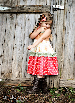
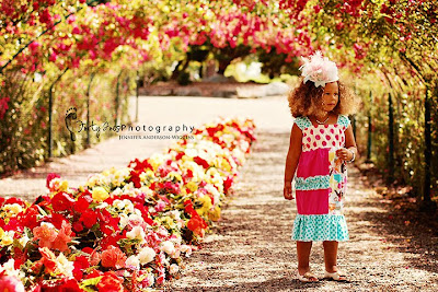
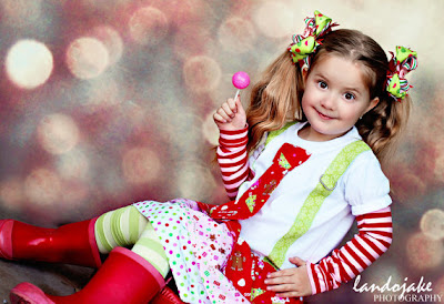
Thankfully, if you don’t have time to photograph your products or the thought terrifies you there are other options. You can get in touch with some photographers, and there are many out there, you can see their work on lots of Facebook pages and ask them if they are trading pictures for product. Most of them do if they have time. You will need to make sure you are both on the same page as to what is expected. How many pictures you will be receiving. I ask for a minimum of 3, I prefer 5 and there are some incredible ones who send me 10 and I get to pick and choose what I add to my listings. Not only do you get incredible pictures, there is another bonus to using a boutique photographer with a large following, ADVERTISING! Most of them will post the pics of the sessions with your outfits and accessories. Just ask if this is their policy. They will also share your name and tag your shop driving new fans right to your pages. I do recommend doing a little research to make sure they are on the up and up, so far I have been pretty lucky with this. I have some faves that I have gone to several times. Jennifer with Forty Toes Photography takes gorgeous pictures and her fan following is HUGE! She will work for you and is a doll to work with. However, she is incredibly busy so if you want to use her get in touch with her and see what her schedule is. I also love Land O’ Jake’s work. The pictures you receive will be top quality, her model is a real cutie and she has an eye for using props that do not distract from the items she is photographing. Her colors pop and she tries to coordinate other boutiques to add accessories to complete the look!

Forty Toes


Land O Jake
If you don’t want to send out your product for whatever reason there are some things you can do yourself to make sure that your products pop and look their best. For starters practice with your camera. Read up on the manual or if you don’t have one look it up online. It is essential to take it off Auto and start using a Manual mode or an Apeture mode. Even point and shoot cameras have these features. Products look best when taken in natural light, set up a small staging area near a well lit window or look online and create a soft box. Heck, go outside and photograph your subject, especially if you are using children. It helps them to relax and gives you more natural looking pictures. The best times of the day to photograph is early in the morning, about an hour after sunrise and in the evening about an before sunset. This is called the “golden hour” as your light gives a warm golden glow. Don't have your subject(s) look directly into the sun, have their backs to the sun and use indirect light. You don't want squinting eyes in the pictures. Additionally make sure that your clothing or accessory is visible and you can clearly see the product that is on display. Talk to the kids, interact with them and get natural smiles. These always look best, or catch them playing, just make sure you are getting the product in the shot. Additionally keep them out of dappled light, you know how you get shade under a tree but there is some sun sneaking in and you have dark and light areas on your subject, you don't want that. Take LOTS of pictures, you will toss most of them out. But the ones you do use you now need to edit. You can buy software, Photoshop Elements is relatively inexpensive and has a learning curve. But, you can purchase photography actions to help make your pics pop. There are several free services as well. Like Gimp and PicMonkey. Play around with the contrast and see if you can make the colors pop a little, maybe you need to brighten it up a bit or darken it a little. These websites will help you. Add a logo, even if it is simply your business name typed over the photo, it helps to protect your investment. Here are a couple of my pics, one taken before cropping and editing and then after.....see what a difference a few minutes worth of work to the pictures make?


These were taken inside and using a piece of scrapbook paper as a background. Get creative with what you use when you photograph as well.

These were taken outside, before sunset with the sun in the background behind the trees. Giving great light, with some editing and cropping the product really pops.

Thank you so much for giving me the opportunity to blog about boutique photography and share a little bit of what I do with my pictures. I personally use a Nikon D80 and I love it. I do use PhotoShop Elements 9 but that can be purchased for less than $100, and they have 11 out now too. Although at this time I don't see any reason for me to upgrade. You can download a free sample from the Adobe website and see how it works for you. You get a 30 day trial at no cost! Plus there are a lot of free photoshop actions you can download and try out as well. I take about 60% of my own photographs, however, I do ship out product as well, I like the advertising, and the fact I don’t have to invest anymore hours into that product. Plus having a variety of models is great! I hope I was able to help out a bit in regards to what looks best for product photography and how you can achieve amazing results.

Thanks Again
Stacey Mann
Hailey Bugs Closet